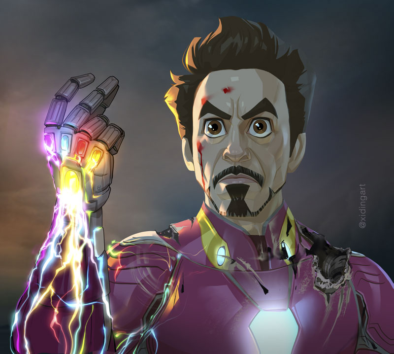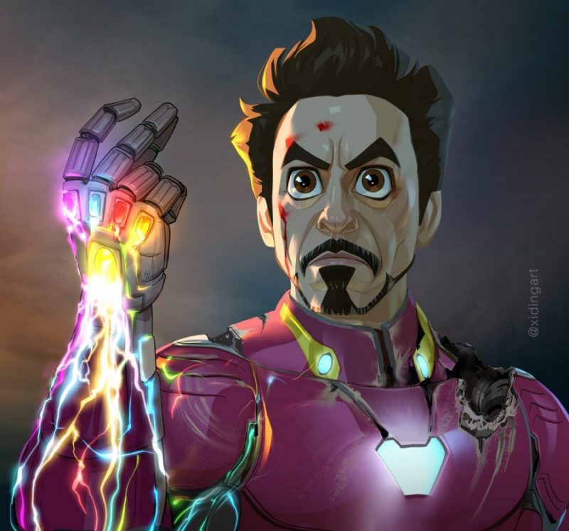
Title image: Caricature of Robert Downey Jr. in the film “Avengers: Endgame” as Iron Man
In this article, I’m going to use this artwork as a sample to explain my approach to caricature in a general framework. I’ll also introduce you to my analytical rendering technique that was used to render this work. Before we get into the concrete discussion of my work, it’s necessary to go over some terminologies first, so that we are all on the same page of the discussion.
Design and Execution
The creation of an artwork usually contains two main aspects – design and execution. The design is about ideas, and the execution is where you turn your design ideas into concrete visual images. When you draw a face by copying from a photo without adding your interpretation or stylization, there’ll be no design elements in the work. On the contrast, creating a caricature is first and foremost a design puzzle, which you have to solve by altering the geometry of the face while trying to retain, or even better, intensify the likeness of the person.
This altering process, or the design process of a caricature, can only be correctly done if you understand the facial geometries in a 3-dimensional space, because facial features like big nose, round eyes, pointy chins, etc., are inherently three dimensional, even if they don’t appear so in our common language. The manipulation and alteration of facial geometries must therefore happen in the 3D space, too. This is usually a mentally constructed 3D space, because the usual reference of your caricature are 2D photos and the final work is a 2D painting. You have to use your knowledge and understanding to extract the three dimensional information from the 2D photos, manipulate them in your mind in a three dimensional way to make the designs, and then execute your design by drawing them back on a 2D paper, or digital canvas.
The same caricature design can be executed in many different ways and styles, either as a line drawing, a cross-hatching drawing, or a rendered painting. These different styles all have one aspect in common – construction of the forms, while a rendered style requires the process of shading.
Construction, Rendering, Shading
Construction is where you draw the forms with mostly just lines but allow them to appear to have geometry and volumes. Rendering is where you add colors, lights and shadows to your constructed forms.
There are lots of rendering styles. Some may be called realism while others less so.
The term shading refers to the rendering style where lights and shadows are added to your rendering, in order to achieve a certain degree of realism. I’ll use a broader definition for realism, which not only includes the usual photo-realism, but also the stylised realism like the Iron Man piece that I’m going to talk about in this article.
I also use the term lighting with the same meaning as shading.
Value and Color
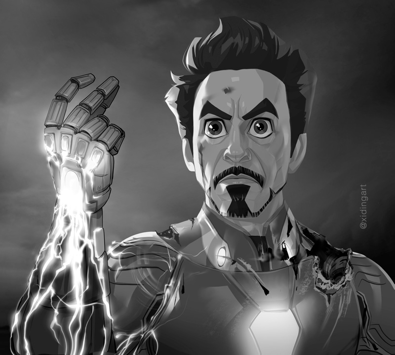
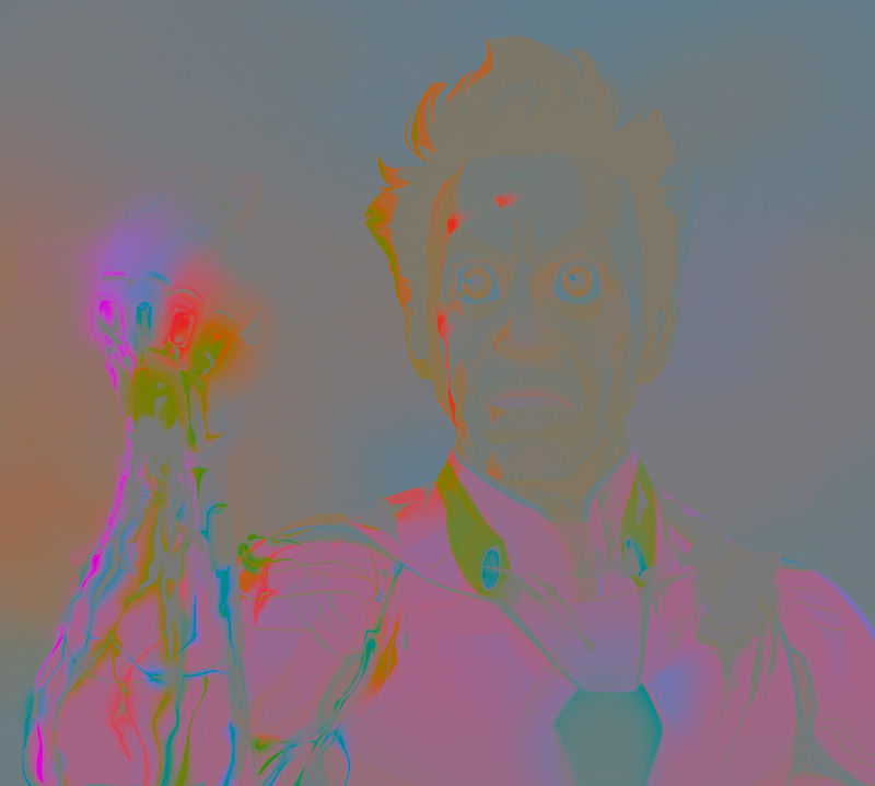
You must have already heard so many times of artists talking about values. Value just means the grey scale value of an image. Value and color are the two components for shading. Let me isolate these two components from my Iron Man piece. As you can see below, the value part is what essentially defines the three dimensional forms, while the color part, striped away from values, doesn’t actually contribute to that matter.
Image 1: Caricature of Iron Man – Values Only
Image 2: Caricature of Iron Man – Colors Only
Image 3: Caricature of Iron Man – Color and Value
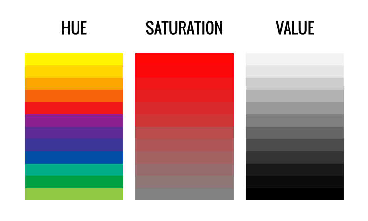
The color includes two further components in it – hue and saturation. different hues correspond to the different types of color, just as you see in a rainbow. In other words, the colors in the rainbow are a list of different hues of color. Saturation determines how colorful or how dull a certain hue of color is. A high saturation of orange is a bright orange, while a low saturation of orange is actually the color brown.
Whenever you render a piece of artwork, your uttermost priority is to get the values right. Whenever an artwork appears to lack three-dimensionality, 99.9% of the cases are due to value issues, if there is no severe constructions issues at the first place. This fact is not easy to see through for a beginner or even an experienced artist.
A side note here. The ultimate reason why value is difficult to get right has a curious origin in the way how our visual system has evolved. It is literally impossible for us to see the absolute physical values correctly because although our eyes are built like a camera, our visual system (i.e. the visual cortex in the brain) doesn’t work like a camera. In my online tutoring course I get down to the bottom of this perceptual phenomenon and I teach my students how to deal with this difficulty and see the correct value.
Image 4: The “Grey Scale to Color” approach
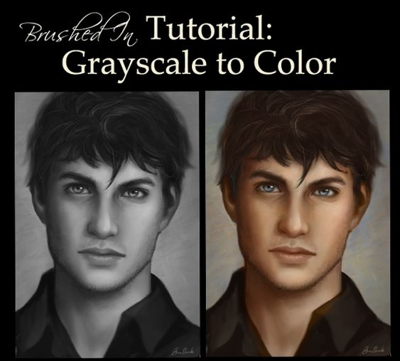
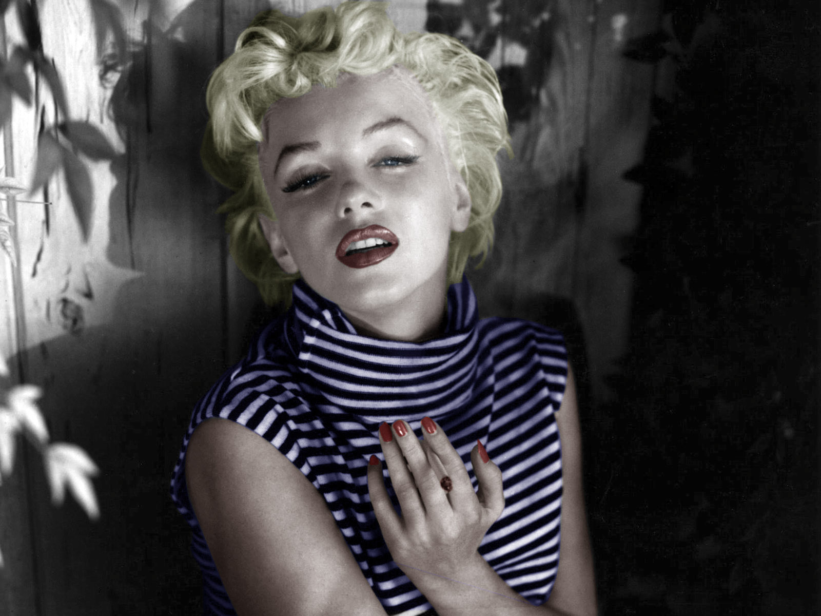
The complexity of value is furthermore exacerbated by the complexity of color. To handle this complexity many artists adopt that approach of starting painting the image in grey scale and coloring it afterwards. This indeed makes it a bit easier to get correct values. However, there’s a price to pay. The results from this approach usually have a certain unnaturally “sepia” looking characteristic (see image 4). Another sample is the coloring of old black and white photos. The results usually lack realism in the way that there’s no color vividness (image 5).
The reason for this color issue is that value changes are usually accompanied by color changes in a quite complex way. It’s difficult to synchronise these changes well the value is already done.
Does that mean you always need to tackle value and color at the same time? That is, after all, what traditional media artists have to do all the time when they want to paint in realism.
However, One of the big advantages of the analytical rendering technique is that it allows you to paint values first, very similar to the “grey scale to color” approach, while avoiding its downside of resulting in unnatural colors. It’s because the methodology obeys the physical laws of lighting and it automatically calculates the color changes accompanying the value changes.
Intuitive vs. Analytical
There are in general two different approaches in digital painting with regards to rendering. One is the intuitive approach, where you render an object by directly choosing the correct color and value as they appear on the object. If a spot on the object has more light, you paint it with a lighter color, if less light, a darker color. That’s very straightforward and it’s indeed exactly the way how painting in traditional media works.
Using the digital media to paint in this approach is not fundamentally different from painting in traditional. In digital you have more tools, for example the layers. You can paint either everything on one layer, or use different layers for different objects, or you can use different layers for different stages of the paintng. Nonetheless, the skills and thought process of choosing the right color and value is exactly the same as in the traditional media.
The analytical approach that I use here is quite different. I use layers, but in a very different way and it involves different thought processes. Before I show you the process of my Iron Man piece, let me explain and demonstrate this approach first with a simpler example that I painted in Procreate.
In the framework of the technique, the creation of this work contains three main stages – sketching, coloring, shading.
Sketching
The sketching stage is the same as every artist does.
I began with the big shapes and proportions (watch the video down below) and then filled in the smaller and detailed shapes. Since I wanted a stylized character, I kept the shapes in straight lines and simple curves as much as possible.In the sketch, I tried to attain a good likeness and an appealing design. However, I tweaked the design in later stages quite often because what works with sketching lines might not work with colors and shadings later on. Also, I often see new issues after a while with a fresh eye.
His crucial facial features are
- round eyes, outward slanting upper eyelids, thick tissue below bottom eyelids
- prominent facial muscle structures and deep folds on the cheek
- thick tissue under the bottom lip
- tilting eyebrows and the folds between them
- Of course his goatee
Coloring
The analytical approach will differ from the other approach After I settled down with the sketch, I filled in the flat colors (color without shading). The shading part will be done separately on extra lighting layers, because I’m going to use the analytical rendering technique, which will be explained below.
The analytical approach has nothing to do with the rendering style. It can be used to render either realistic or stylized artworks. This piece is rendered in a stylized manner, but I have done other pieces in a much more realistic manner with this approach too.
Diffuse Reflection and Specular Reflection
Every object we see in the world, which is not a light source itself, reflects light from some light source, and when the reflected light reaches our eyes, we see the object. In other words, we see (non-glowing) objects through reflections. That’s what the “reflection” part of these two terms means.
As a matter of fact, every light ray reflected from a surface is split into these two parts – diffuse and specular. They have different physical origins and very different visual appearances. I’m not going into detail here explaining what they are, but let me simply state that they should be thought of as different rendering components and be painted on separate layers. That plays a crucial rule in achieving realism.
Another side note here. The widely spread notion of the specular and diffuse reflections taught in high school physics, for example here, as well as taught in the traditional art education is unfortunately wrong and causes quite a lot confusion in painting realism. If you were not familiar with these concepts before, I’ll show you the right way to understand and paint them.
Painting Light and Painting Shadow
The layer blending mode plays a crucial role in the analytical approach too. In digital painting you can paint light itself on a layer by using the blending mode “ADD”, and paint shadow by using the blendng mode “MULTIPLY”. Let me clarify
- Painting light – it means adding light to the image directly. You need this for the analytical In the color theory it’s called additive color mixing.
- Painting shadow – shadow is simply the absence of light. Painting shadow means painting those areas where there should be less or no light by taking away existing light on an image. That’s how we take away light, or equivalently, add shadow to an image.
In a strict analytical approach I separate the diffuse and the specular reflections from every light source (An object is usually lit by multiple light sources in the real world) and paint them on different layers. I also separate the different light sources on different layers. In practice, I sometimes merge the diffuse and specular of secondary light sources together, just in order to keep the layer numbers down.
Here is a video showing all the lighting layers that I used in this demo rendering. Let me explain what they are.
- Direct light diffuse – diffuse reflection coming directly from the light source
- Bounce light diffuse – diffuse reflection of bounced light from the environment
- Direct light specular – specular reflection coming directly from the light source
- Bounce light specular – specular reflection of bounced light from the environment
- 2nd light source – similarly it should be divided into direct light and bounce light, and then each of them further divided into diffuse and specular reflections. However, I omitted the bounce light part because it doesn’t contribute much visually.
- 3rd light source – similar to above


